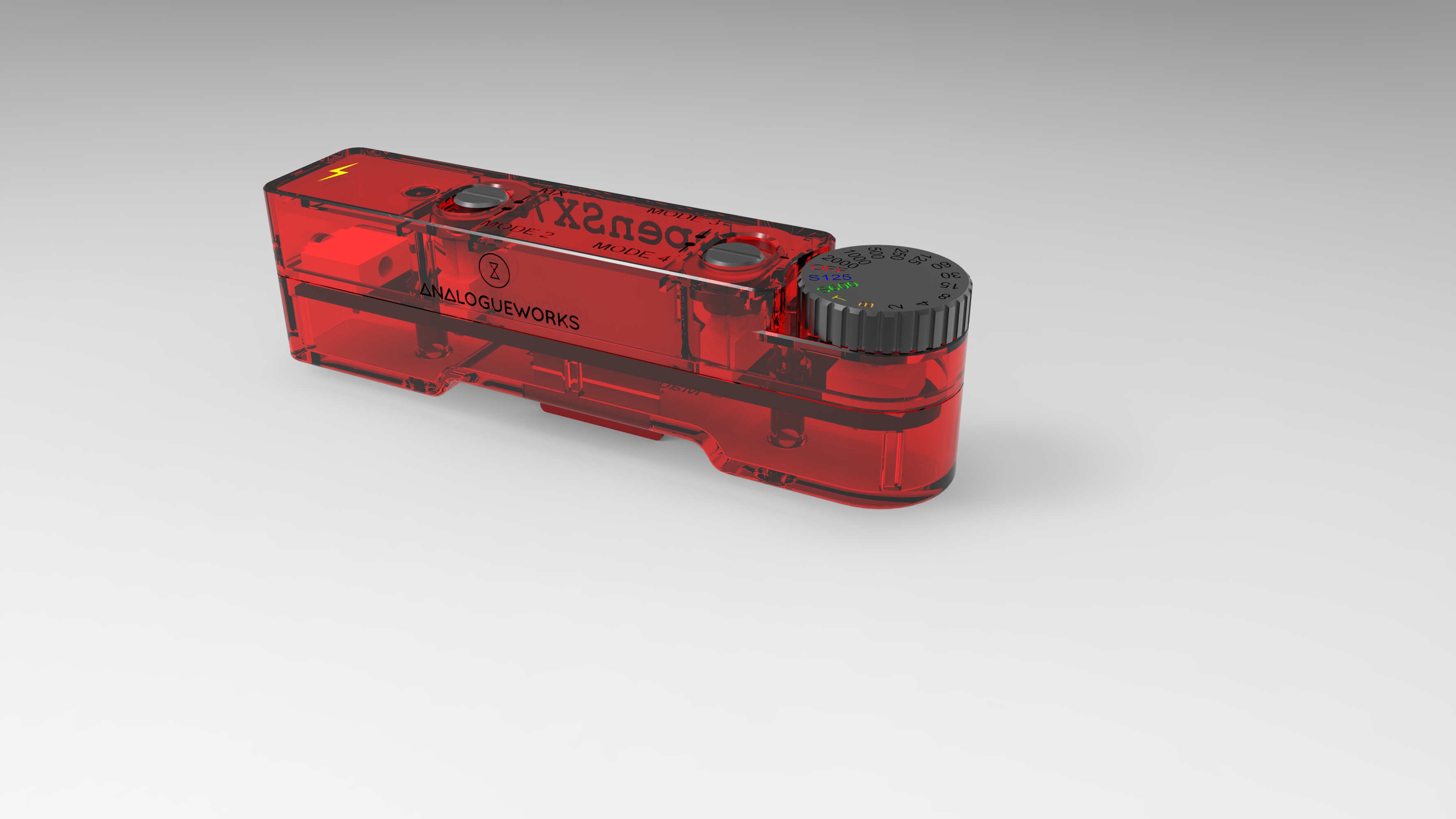
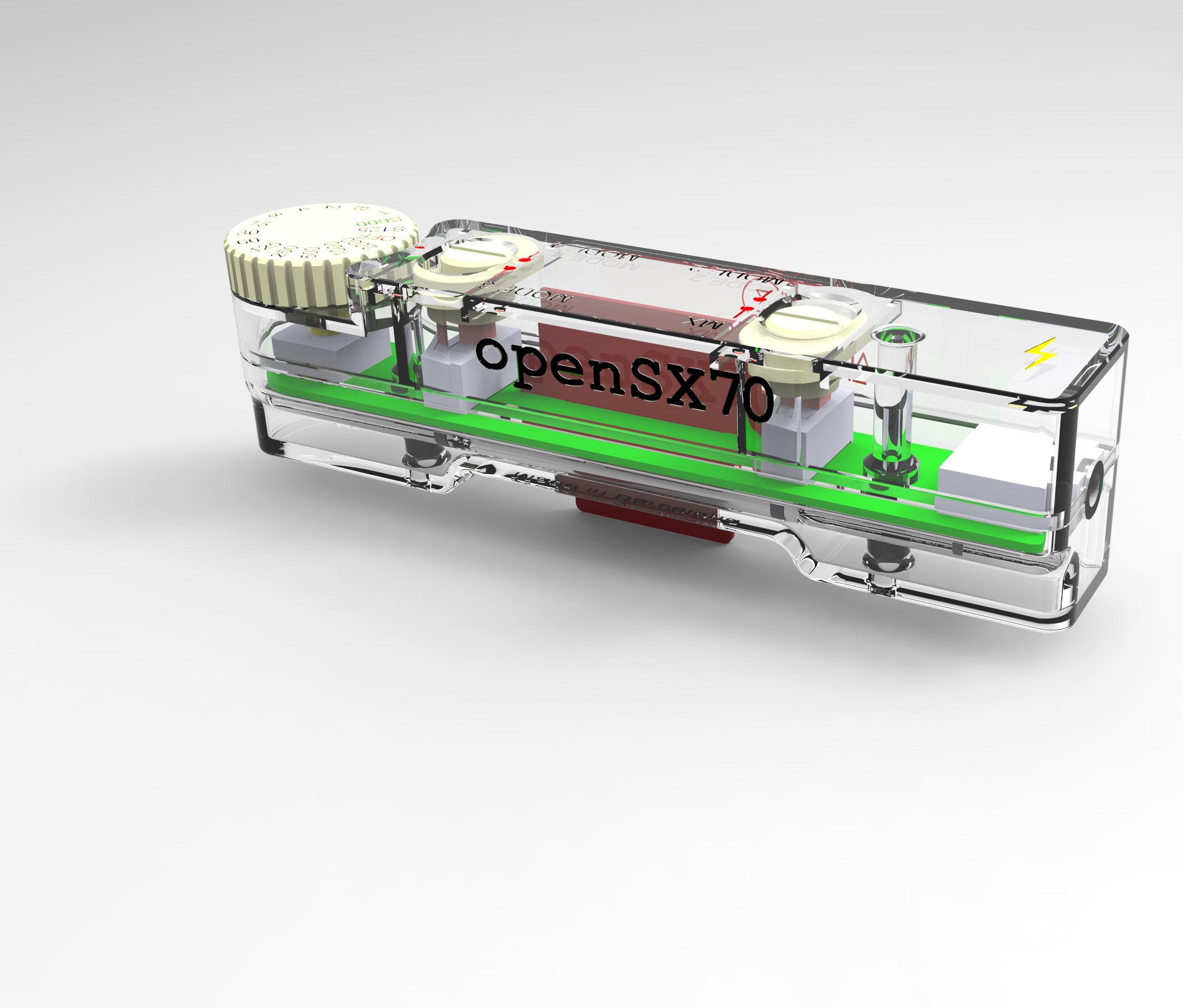
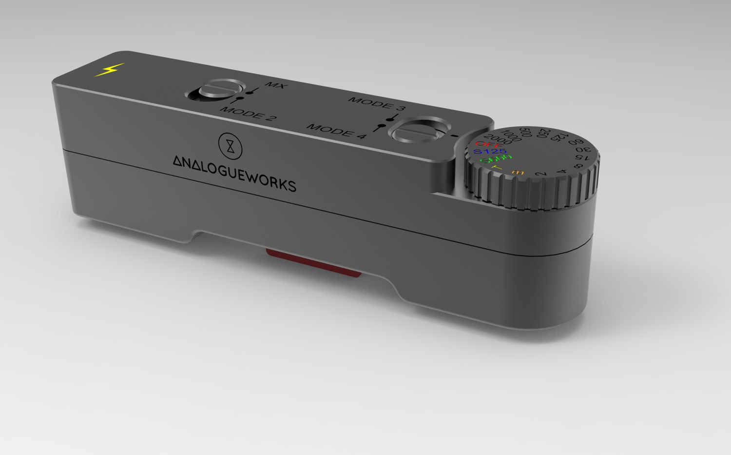
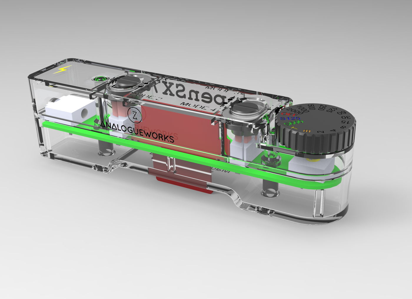
the dongle renders
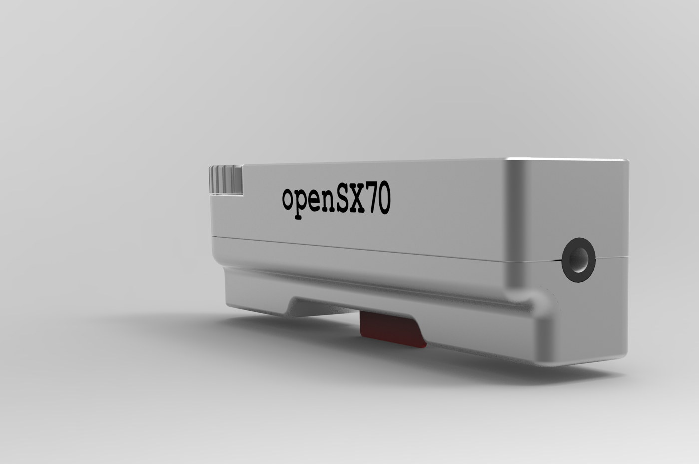
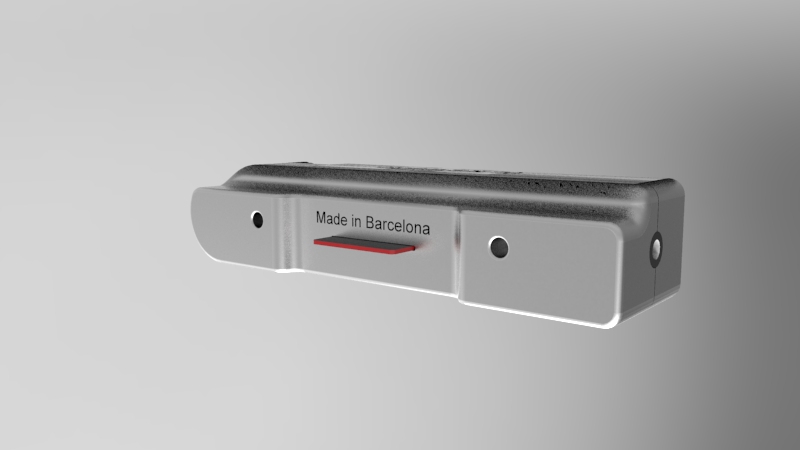
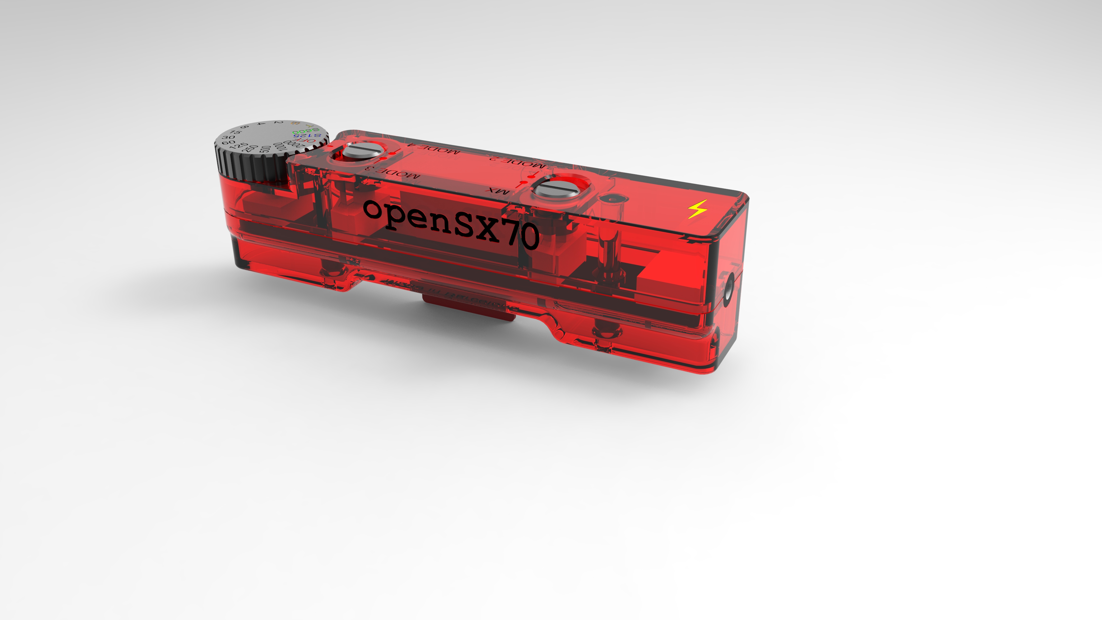
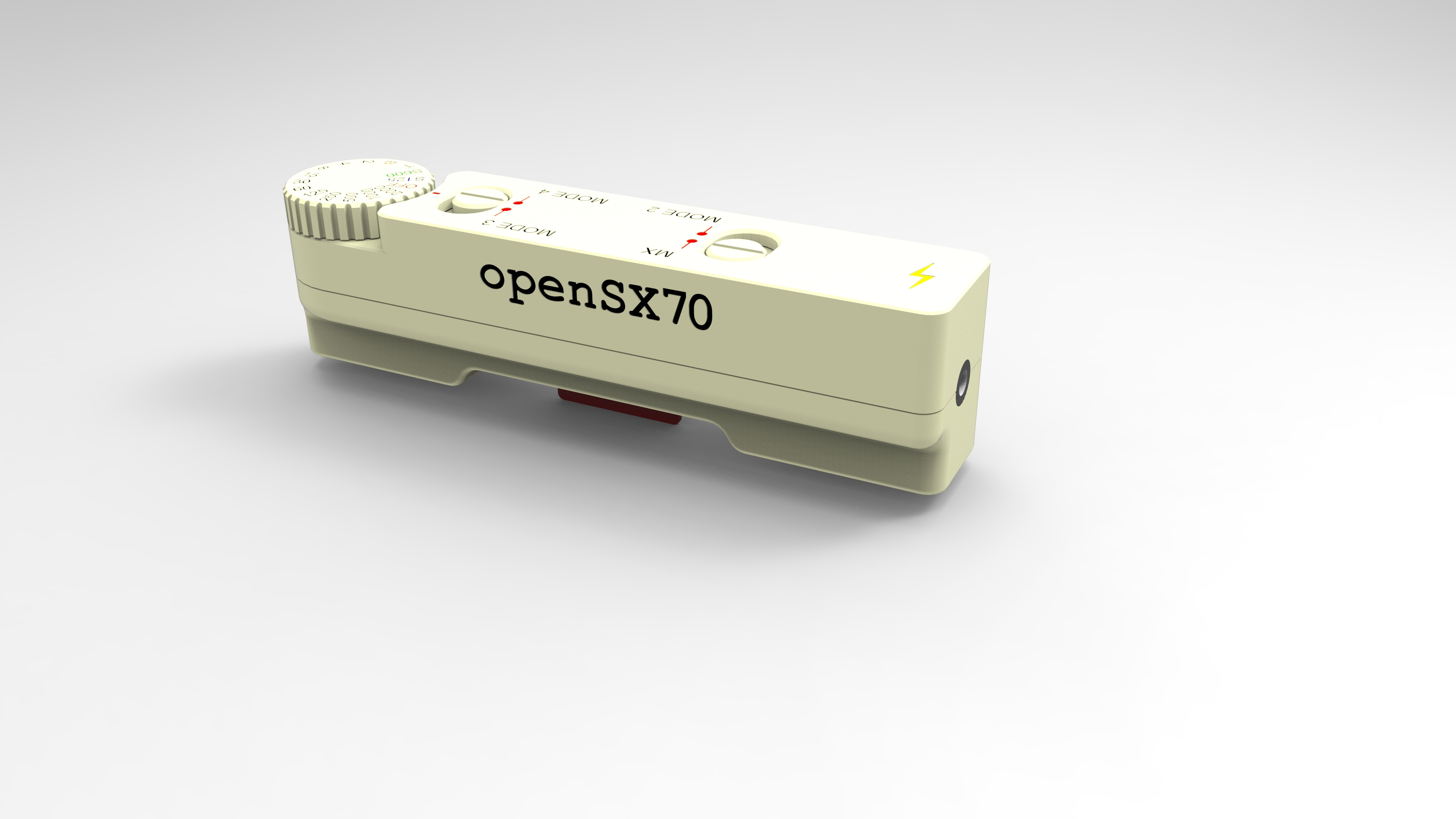
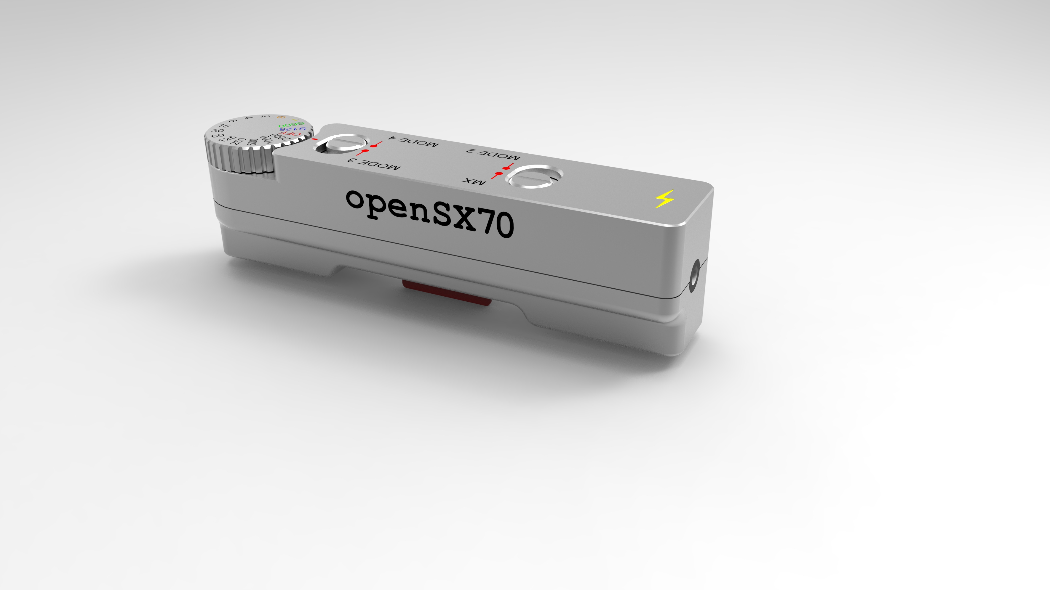
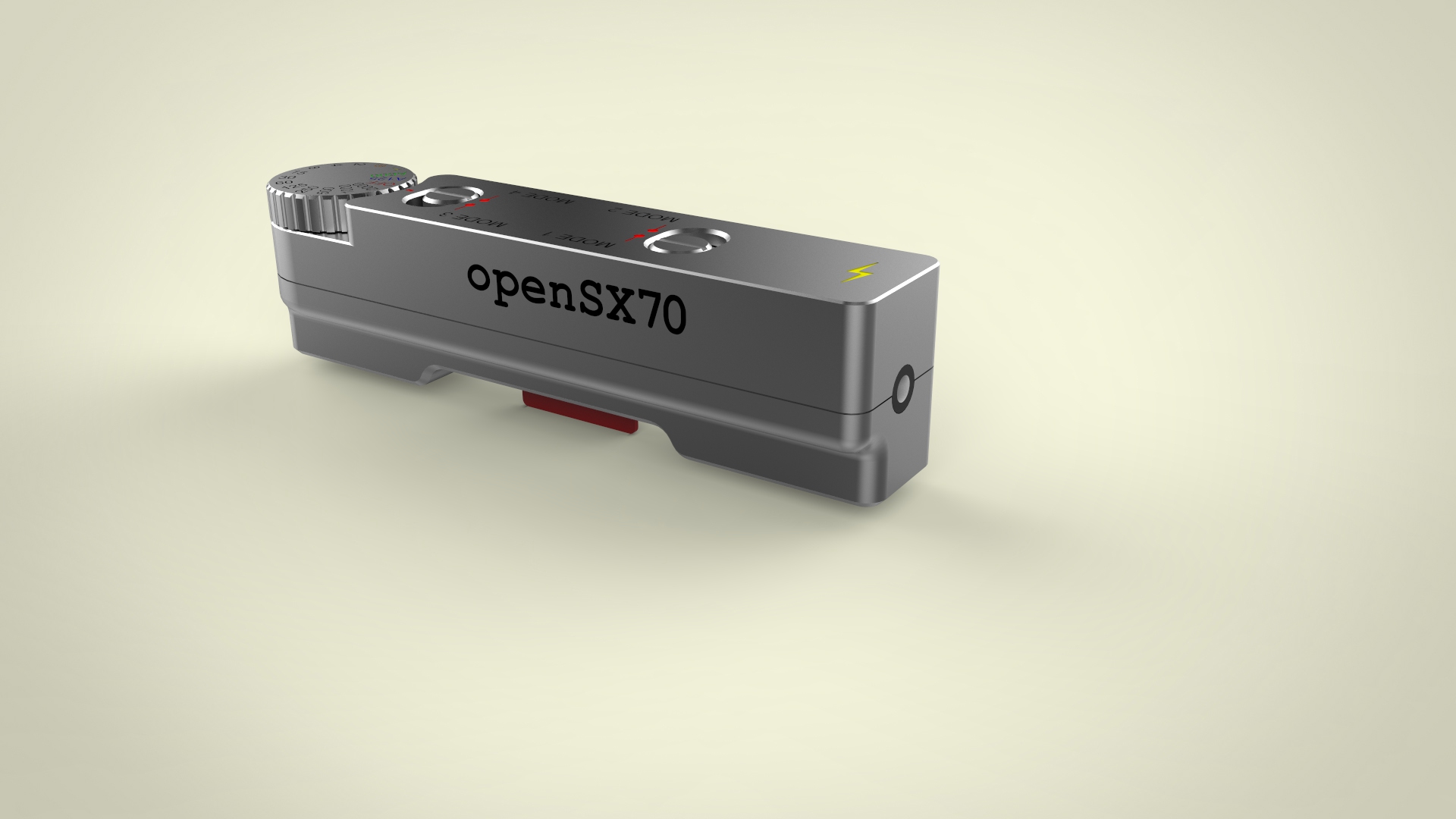
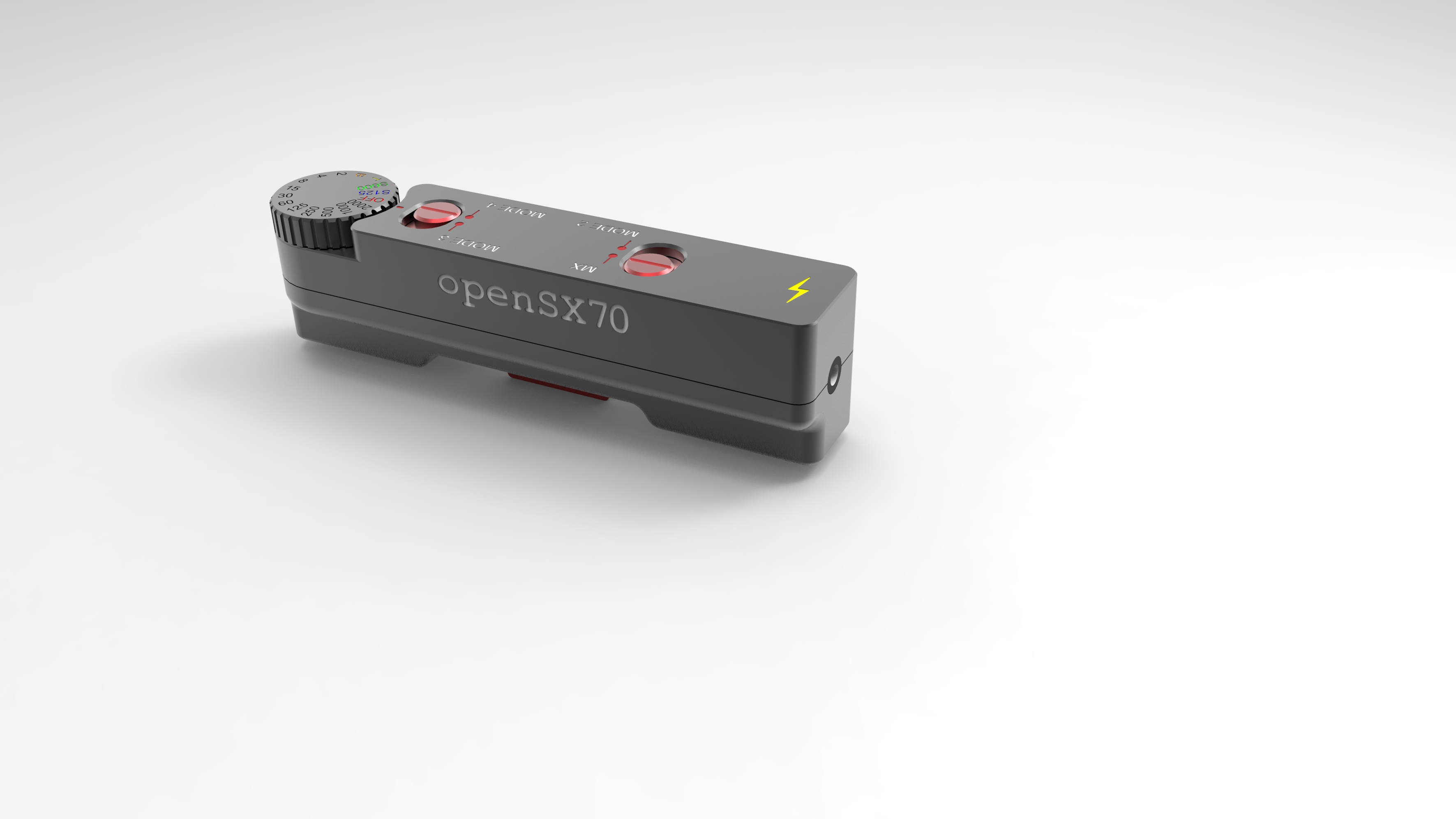
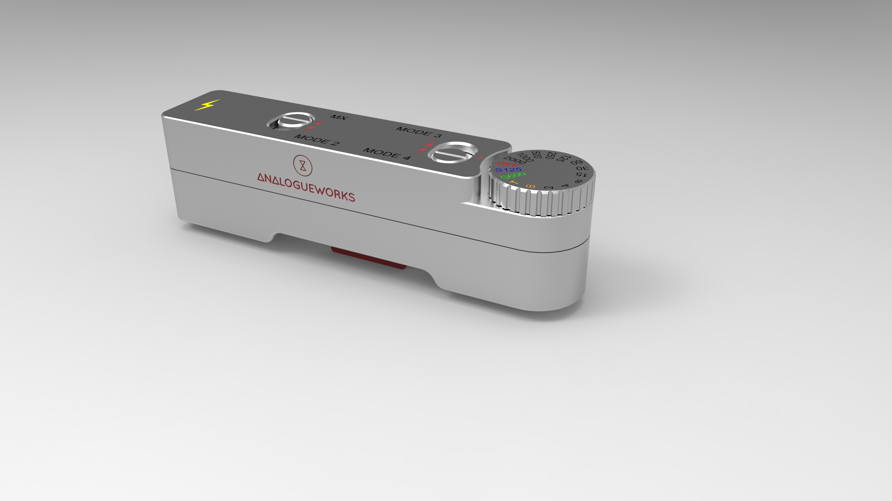
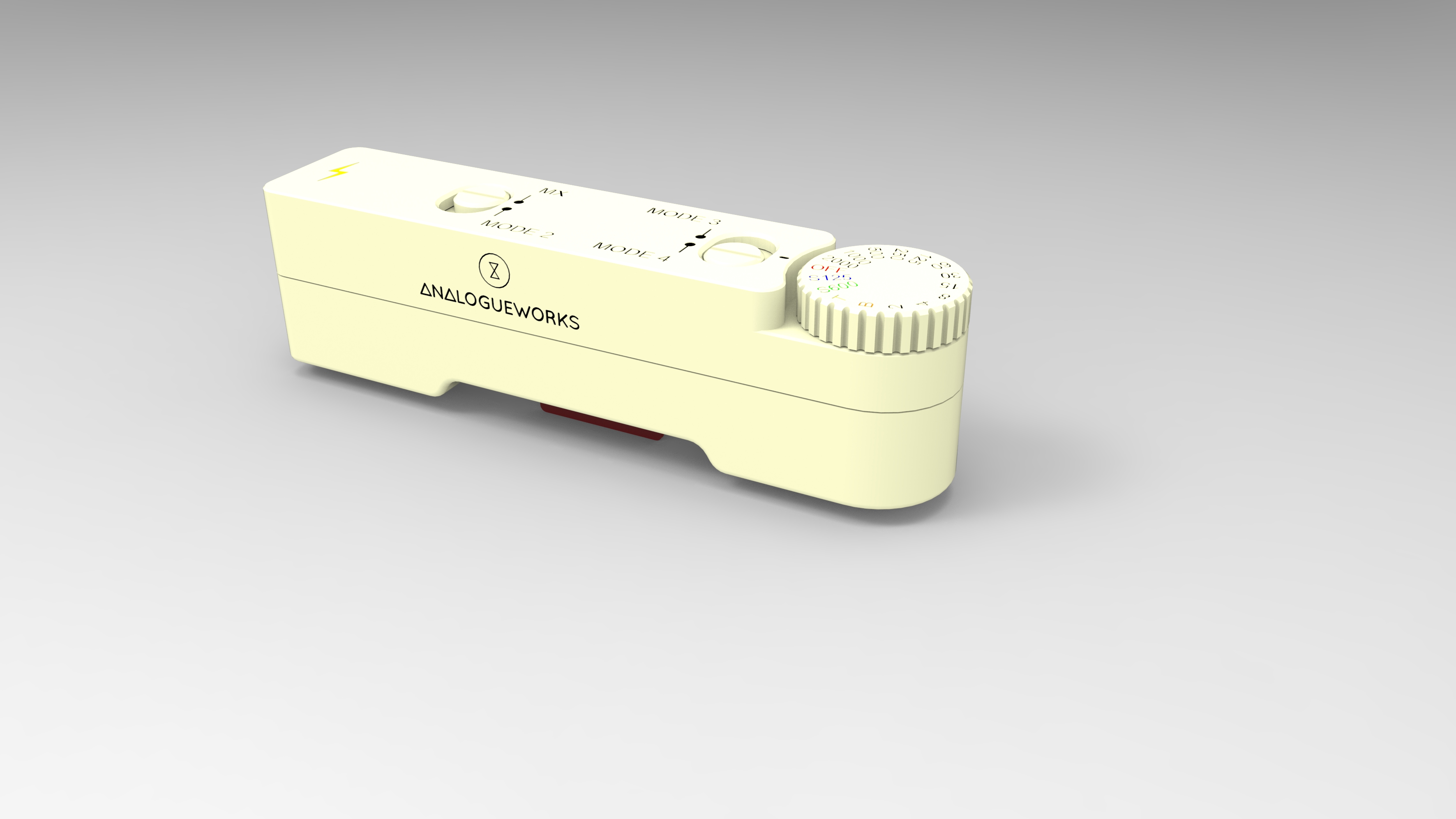
These are the latest renders by AnalogueWorks. Please bear in mind that they very early designs, and, that for sure, they don’t reflect how the actual product will look like. They don’t.
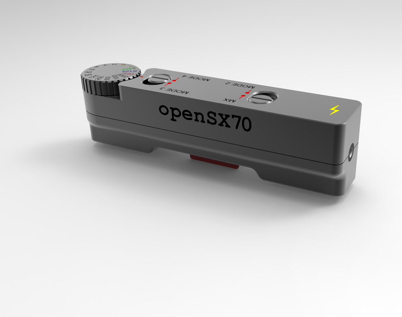
But what they certainly reflect is where we want to go, the kind of quality we wish to archive, the kind of materials out of which we would like to make it. Clear plastic, colored clear plastic, aluminium, anodized aluminium… and then all white, all black, red…
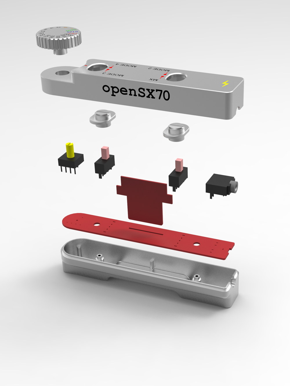
I remember going as a child to the London Design Centre in Haymarket to see all those beautiful objects, I love italian design, and I am a great admirer of Dieter Rams. In fact I have a huge poster in my workspace with the 10 rules of good design.
Of course now I am a big fan of design “made in Barcelona”, and that is why I am thrilled to partner with Santi in this important part of the project. And as I always say, and I mean it, this does not mean that I don’t support other existing and future dongles!
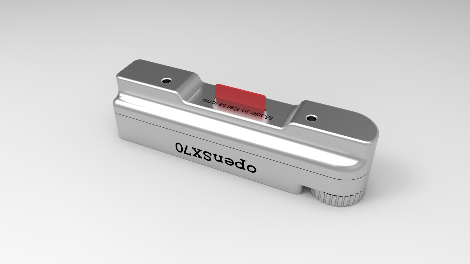
Some people say it looks similar to X or Y. Well, let stress again that this is still a very initial concept. As a matter of fact in the beginning I wanted an “age apropiate” design for the dongle, that is, something that might have come out of Polaroid in the seventies, and who knows, may one day someone will design a dongle like that. But answerig the critics, I say that a dongle is a dongle. For instance, I wanted to place the selector on the other side, you know to use with the left hand, my crazy idea. But it does not make any sense! So in the end, the logic of things, in a way, dictates the product.
Just enjoy the pictures.


Comments